During my early days at Paycor, I created and managed a Sketch library of reusable, configurable symbols to improve the understanding of the intricacies of components by designers and the empathy towards developers. Because of this library, designers can use symbol overrides to mimic properties of the components and quickly produce wireframes.
To keep alignment with the code, I released updates to the symbols library when updates had been made by development. Until a change was made in the code, the library did not contain the design enhancement.
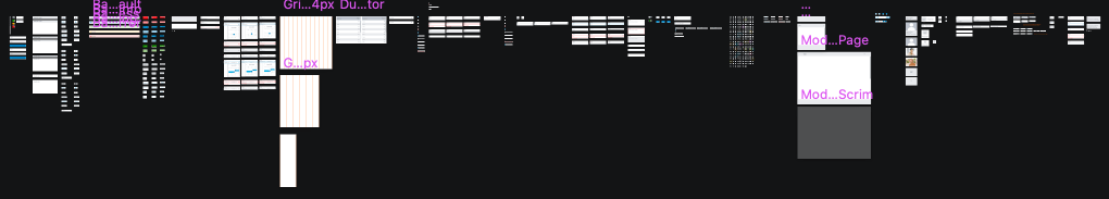
Bird’s Eye View of All the Symbols in the Styleguide Sketch Library
The library consists of 527 symbols. Many of these symbols are nested as simple overridable options within the more complex symbols.
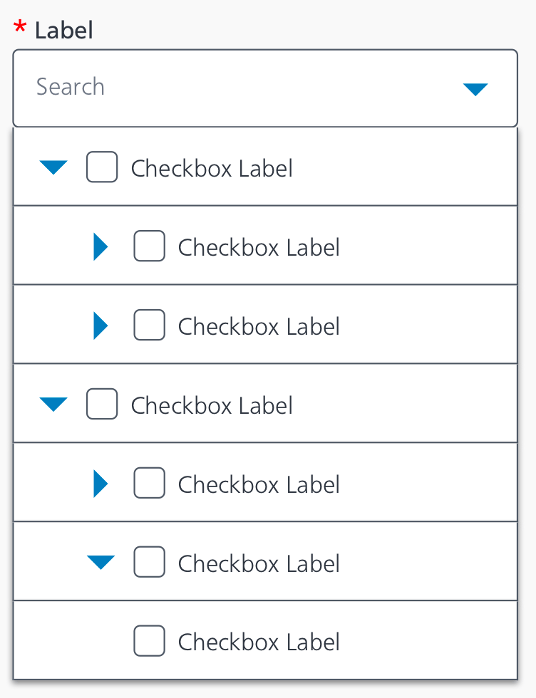
An In Depth View of One of the Symbols: Tree Select
The tree select component allows a user to view the selectable results in a hierarchy. The component is searchable and can be configured for the selection of the parent item to auto select the children item or view them as separate selectable entities based on the use case. The component can also allow single select or multi select.
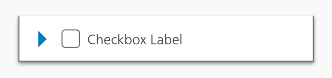
Parts of the Tree Select Symbol Grouping

There are checkbox and radio button symbols as part of this tree select symbol. In the library, those are symbols themselves. Using symbols within symbols allows more flexibility to display functionality like a checked checkbox within the tree select.
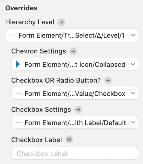
An even deeper dive into a symbol piece of the Tree Select: Form Element/Tree Select/Item
The overrides for the Form Element/Tree Select/Item
These were organized and named to provide clarity in the configuration process.
 Amy M Street