I am designing components for the latest version of the State Farm Design System. This system is the most collaborative and well built system I have been privileged to work on. It is developed with stakeholder use cases and accessibility standards, resulting in a solution that users are excited to adopt and utilize.
What makes a good system
The true power of a good design system lies in the ease with which its components can be configured by designers who use them.
Even if the component has all the correct variants for the end user, it’s configurations must be intuitive to the leveraging designers.
A well designed component has the appropriate amount of properties exposed without overwhelmed all of the options. This includes appropriate naming of variants, a hierarchical order of those properties, and nesting subcomponents when it makes sense.
Property Names
Choosing immediately recognizable property names helps with quicker understanding of what the property will change, and requires less documentation. General terms also allows for cohesive properties across the design system.
size: lg | md | sm — can be used for anything that has sizes
expanded: true | false — can be used for anything that has expansions like a menu or accordion
state: default | hover | pressed | disabled | readonly — can be used for anything that has interactive states
Nested subcomponents
The progress-stepper component is built with nested subcomponents to simplify the configuration options for the designer. The nested subcomponents are mostly helpful for building and updating the component from the design system perspective.
Here are the nested subcomponent pieces:

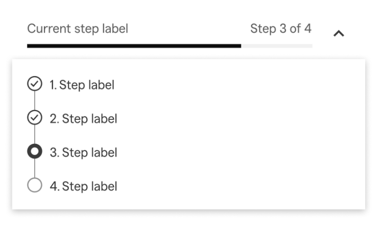
The only thing that is exposed to the progress-stepper main component is the step state and step label.
The properties of the progress-stepper component are:
- type: # | %
- expanded: true | false
- active-step: 1 | 2 | 3 | 4 | 5 | 6 | 7 | 8
- #-of-steps: 1 | 2 | 3 | 4 | 5 | 6 | 7 | 8
- And then each step with the following exposed:
- state: default | hover | pressed
- label: Step label
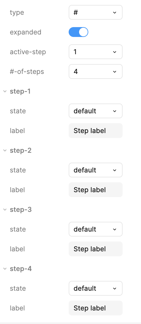
Here’s what that looks like in the properties sidebar:
Examples in use:
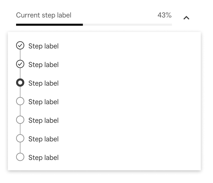
As the designer changes the #-of-steps, multiple things in the component change. The label “Step # of #” updates based on the number of steps chosen as well as the active step. When type: % is chosen, the label turns to the appropriate percentage. The progress bar also updates accordingly along with the status of the completed and in progress steps.
type: #
expanded: true
active-step: 7
#-of-steps: 8

type: %
expanded: true
active-step: 3
#-of-steps: 7
 Amy M Street