A 50-component responsive web design system leveraged by 100+ designers, with an alpha release of a 30-component native mobile design system.
The success of the design system is attributed to consistent design and dev alignment, documentation with usage guidelines, and accessibility best practices.
I originally joined the company as a contributing designer working on a product that leveraged the design system. After leading collaborative discussions about patterns and standards within my product group, I was promoted to be the lead designer on the design system where I was able to guide global standards.
Both responsive and native components were founded with the same color variables, default fonts, and spacing standards. The components and patterns were designed and developed with the flexibility to meet theming and customization needs. The designs were available in Figma and the developed components and patterns were available in Storybook.
A sample of similar components
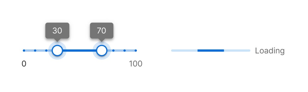
The slider and progress components leverage alike colors from the primary color family and the same fonts. When applying a new theme with a different primary color, these components would be recolored to align with that theme’s primary color.
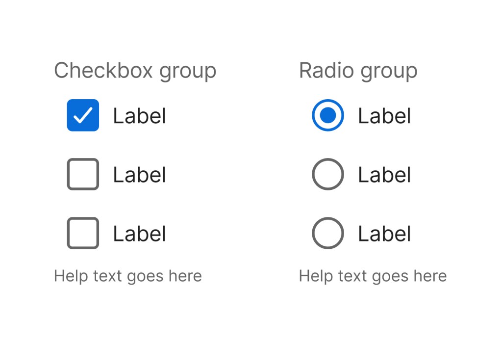
The checkbox group and radio group have consistent font sizes, spacing, color, and touch points.
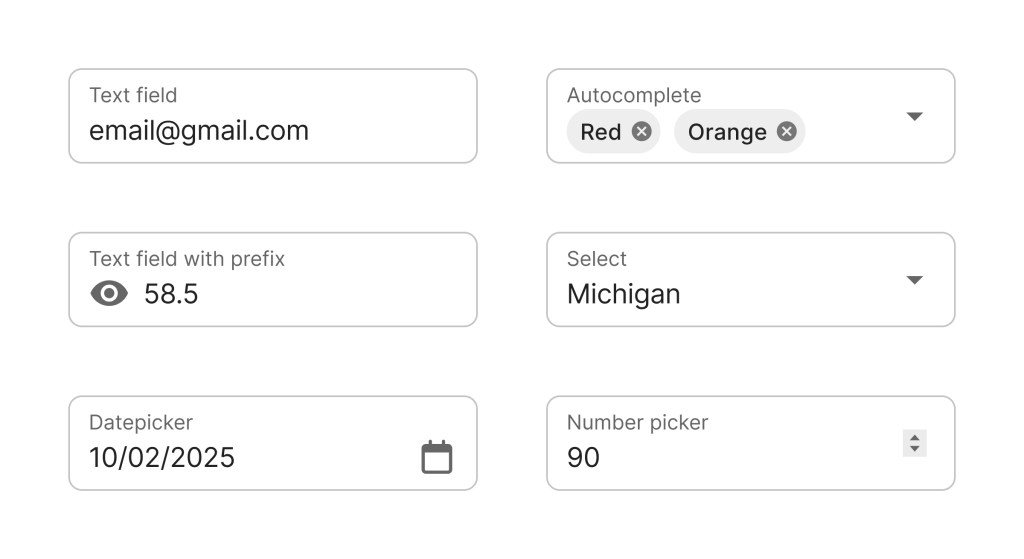
The form fields use the same spacing and style standards as each other.
Responsive and Native
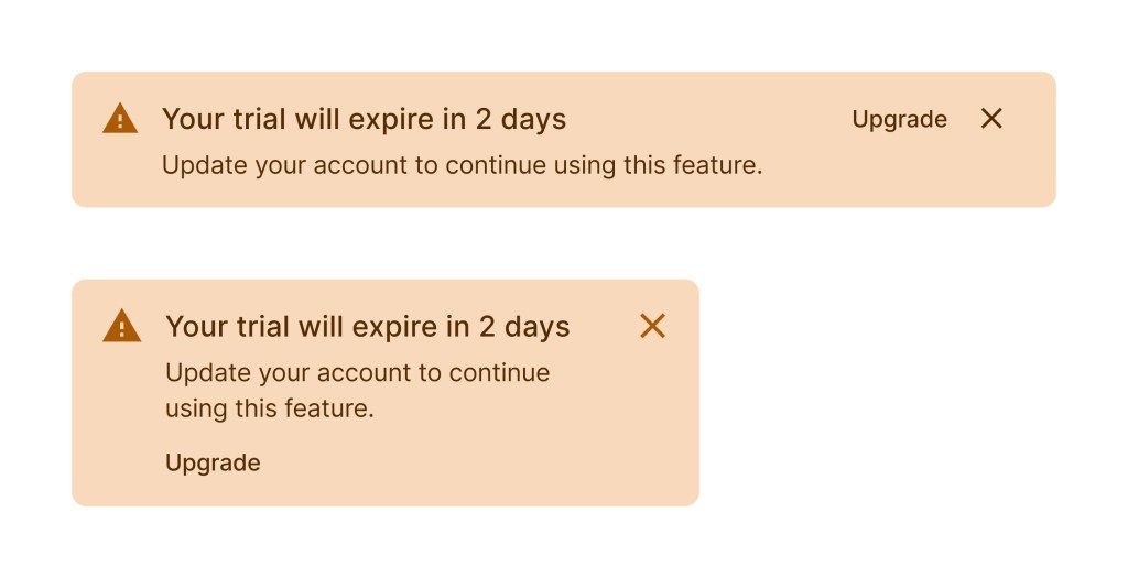
Here’s an example of how the components can differ slightly based on breakpoints and native environments. For mobile needs, the action button of the alert comment was relocated to the bottom of the alert. Component details were maintained throughout the different environments for a cohesive system.
UI Kit
This example shows the documentation and grab and go examples for the alert component from the UI kit.
 Amy M Street