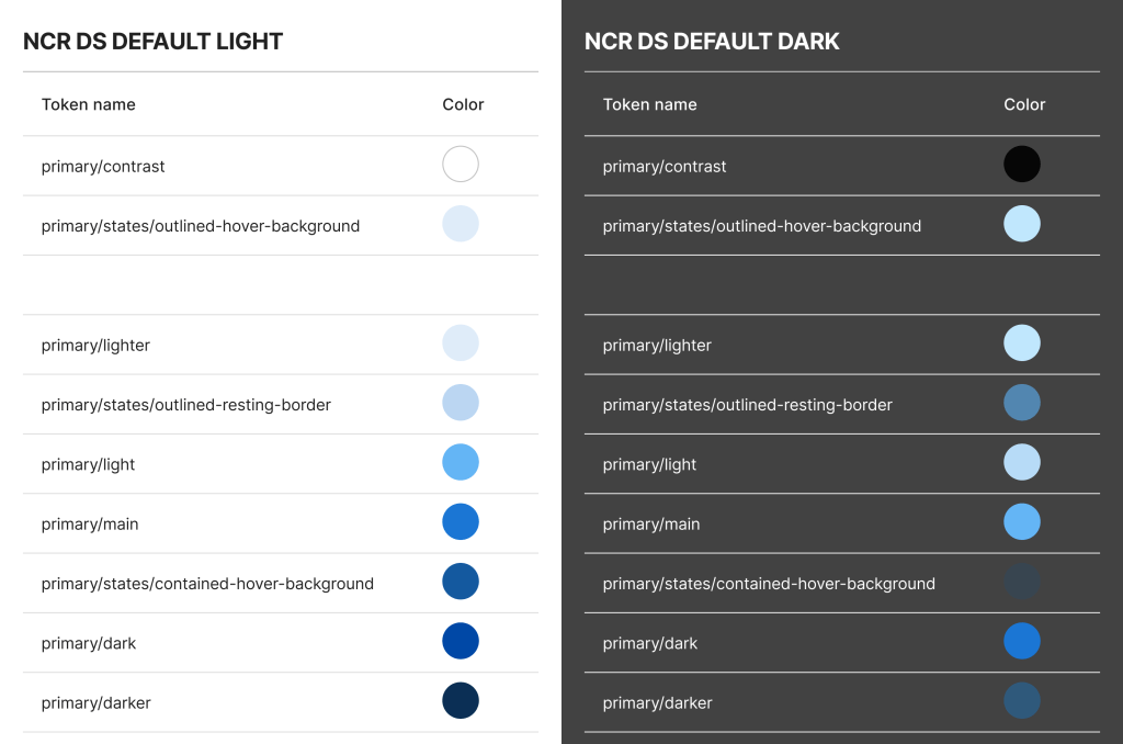
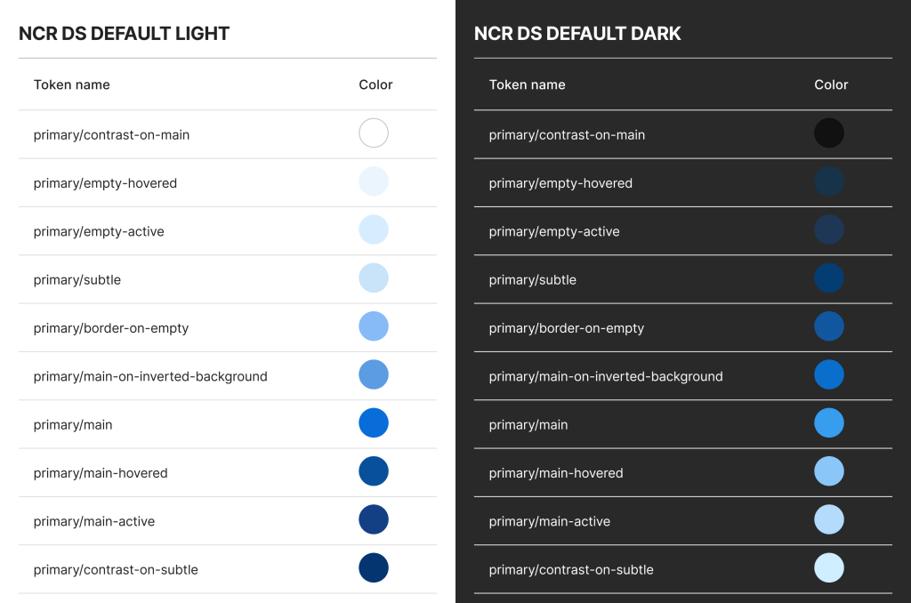
Rather than continuously maintaining separate library files at NCR, where one contains light themed components and another contains dark themed components, we renamed our color tokens to leverage Figma’s theme swapping function.
Functional Token Names
Renaming our color tokens to have functional names, we went from names like primary/lighter to now be primary/subtle,
and primary/darker to now be primary/contrast-on-subtle.
Old Token Names
With the old token names, each component required logic to be built into the design files and dev files to switch to the different color tokens. Notice that tokens like lighter are lighter in both these themes and darker are darker in both themes. These names describe the color rather than the function.
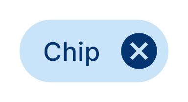
Here’s the chip component with the old light theme:
text: primary/darker
background: primary/lighter
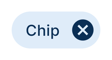
Here’s the chip component with the old dark theme:
text: primary/lighter
background: primary/darker
Here’s what the old dark theme would look like when applied to the old light theme components. As you can see, they do not theme swap appropriately.
New Token Names
With the new token names, we are be able able to maintain one single core component library and allow theme swapping for light theme, dark theme, and all custom themes.
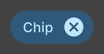
Here’s the chip component with the new light theme:
text: primary/contrast-on-subtle
background: primary/subtle
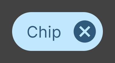
Here’s the chip component with the new dark theme:
text: primary/contrast-on-subtle
background: primary/subtle

With these new theme-swappable, functional color token names, the design system team is able to maintain one core library rather than multiple separate libraries, and the designers and developers leveraging the design system are able to easily find the correct component and use the correct colors that they need.
 Amy M Street