An Update to Paycor’s Color Palette to Improve Accessibility
The Process
I audited the component library code to determine color usage of the old color palette. As certain colors were removed, the component was repointed to the new colors.
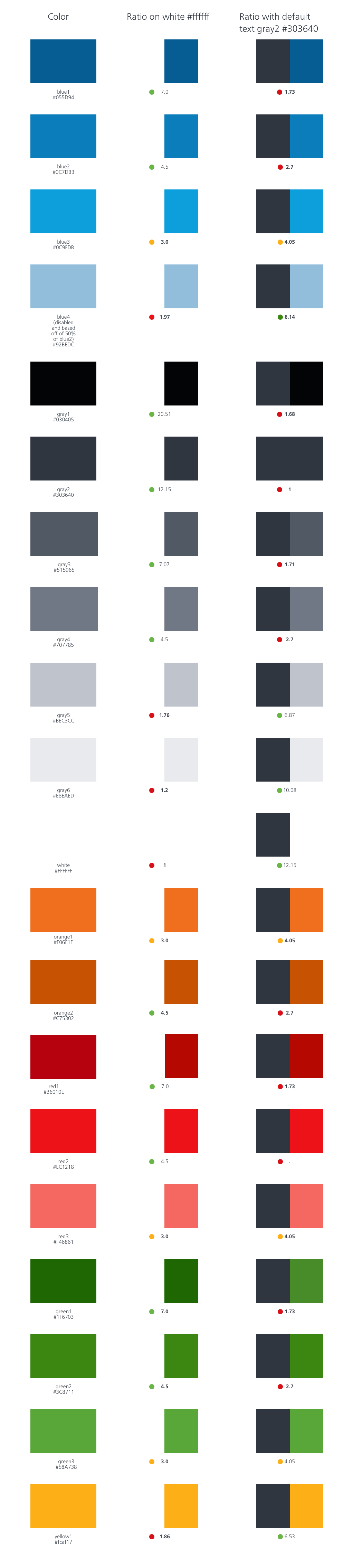
I updated the colors so that the default state has a 4.5 contrast ratio with white, the active state has a 7.0 contrast ratio with white, and the hover/focus state has a 3.0 contrast ratio with white.
While updating the colors, I was mindful of the ratio with white because our colors are often juxtaposed with white. Gray2 is our default text color, so that was a helpful comparison as well.
Old Color Palette
Previous palette did not consider appropriate contrast ratios for AA compliance. Contained lots of light grays that are hard to distinguish.

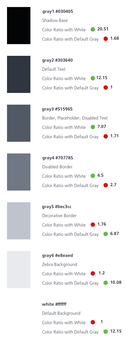
New Color Palette
Colors were adjusted to have compliant ratios. Meaningful usage was assigned to each color. Grays were consolidated.
Aligning Color Increments to Accessibility Levels
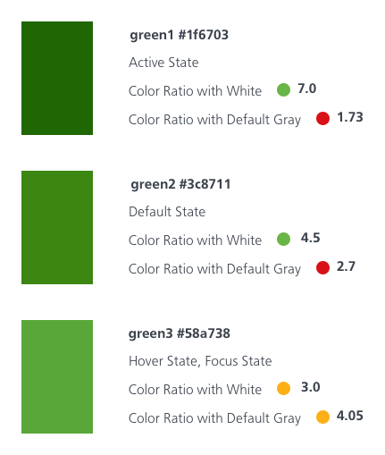
Old Color Palette
Each color existed in levels 1, 2, and 3. The shades were arbitrarily selected.
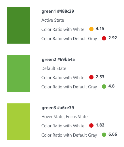
New AA Compliant Color Palette
The color levels were set based on AA benchmarks with level 1 at 7.0 contrast against white, level 2 at 4.5 contrast against white, and level 3 at 3.0 contrast against white.
Reducing Unnecessary Grays
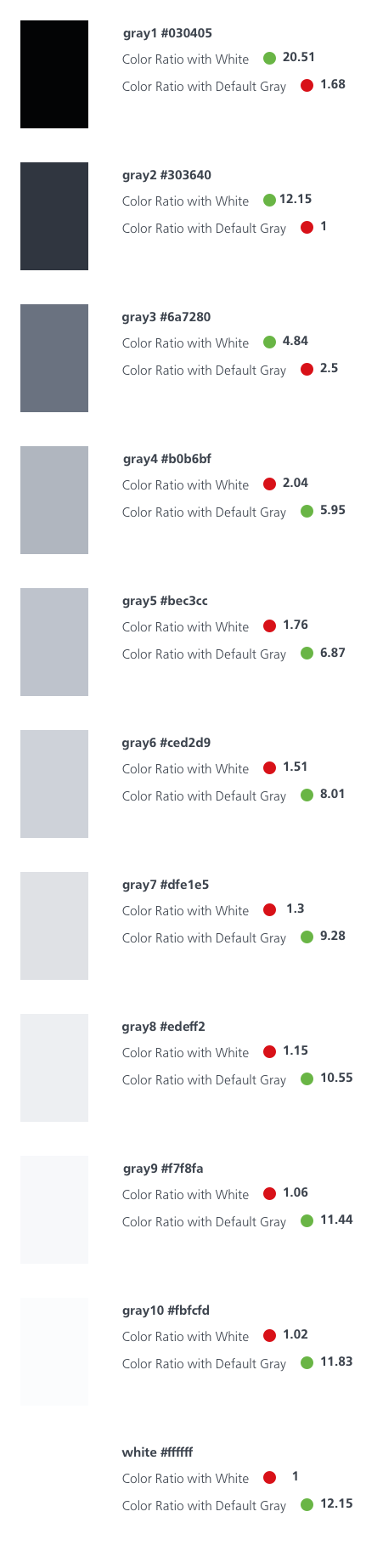
Old Color Palette Grays
The old color palette had 11 grays with a lot of indistinguishable light grays.
New Color Palette Grays
The new color palette has 7 grays and each gray is meaningfully assigned to a usage.
 Amy M Street